| Zoha Zulfiqar
In this blog, we are going to learn how to make a canvas application responsive. A responsive layout responds to any type of screen size or device for an optimized user experience.
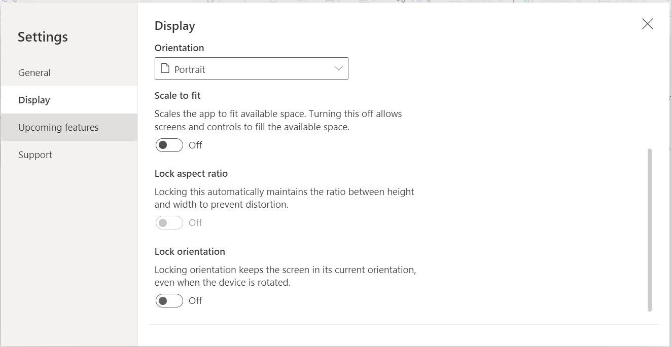
For making a canvas application responsive, first we need to make some changes in the settings after creating a new canvas application. Go to Settings – Display – turn off Scale to Fit and Lock Orientation.

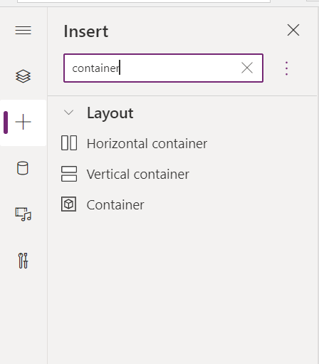
Containers makes it easy to create a screen responsive, every control added inside a container is automatically positioned. There are three types of containers in canvas application that can be used to make the screen responsive. From the left side, click on + (insert) and search for container, you’ll find horizontal container, vertical container and container.

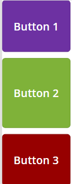
This container positions each control side by side, from left to right. Each control can either have a custom width or a flexible width, container portions can be filled with each control as desired, a flexible width is considered for making a screen responsive.

This container positions each control top to bottom. Each control can either have a custom height or a flexible height, container portions can be filled with each control as desired, a flexible height is considered for making a screen responsive.

This is a simple container where a control can be positioned on top of any other control.

There are many properties of containers that can be customized to get the desired responsive screen such as fill portions, gap, vertical or horizontal overflow, wrap, and more. Exploring each property can lead to a responsive design.
Join us next time, as we continue our journey of learning canvas apps.Click here to learn more about Imperium's Power Apps Services. We hope this information was useful, and we look forward to sharing more insights into the Power Platform world.

