| Aqsa Nabi
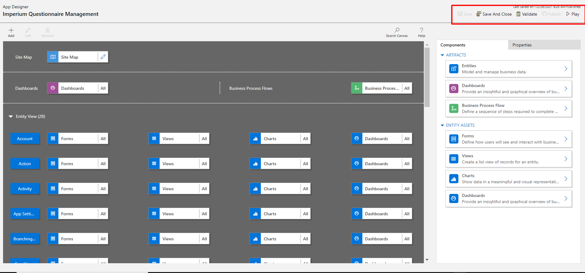
An app designer is used to design the whole page of the Model-driven app. The designer helps determine which table should go inside which group. There are simple options available right on the screen which makes the design much easier than before. The developers can design the page of Model-driven app by selecting areas, Groups, and Tables that should go together.
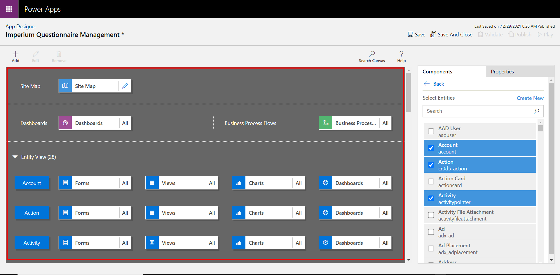
App Components:
The App components is the section where the developers can create the Groups and define entities in each Group. The Groups include the Dashboard, which has a representation of the charts created in the Dynamics Dashboard, then there are multiple Groups with a bunch of tables in them. The entities are created in the Components section, where each entity has a different form, having a couple of fields of different types, establishing relationships with the tables.
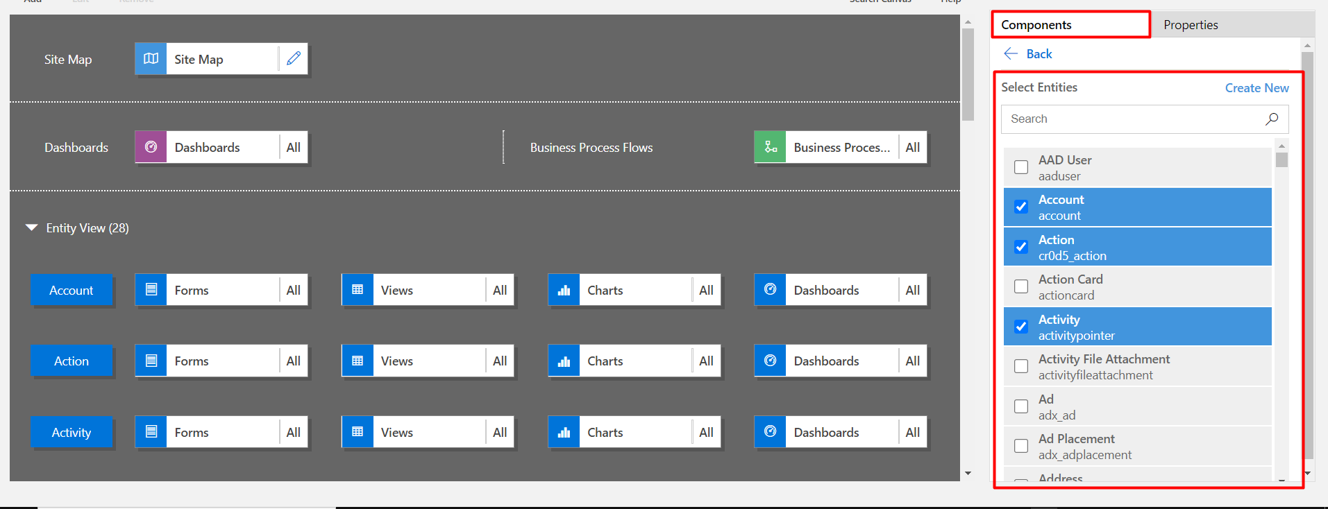
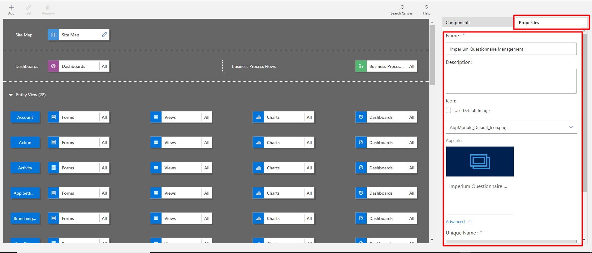
Properties:
This section is used to define the name of the Model-driven app and provide a relevant description for the app name. There is an option named ‘Icon’ which has multiple options to set an image as the icon of the app or use the default icon which is displayed on the screen. So the app designer can either pick one of the existing icons from the list or chose the default image.
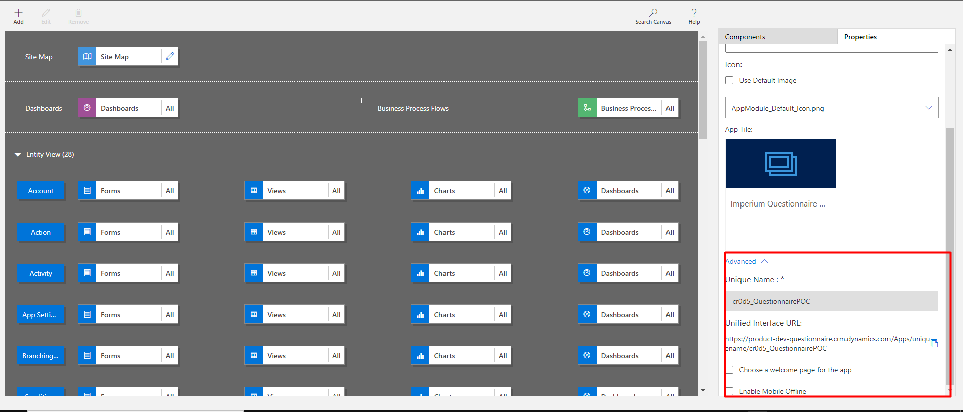
Below are some advanced settings such as the Unique name of the app, any specific URL of the app. Here, the admin can define the welcome screen that should display whenever the app is opened. And enable the mobile version of the app.
All the settings made in the app can be saved, which will only save the changes but won’t take effect on the running system. However, the Publish button saves the changes and published them on the live app as well.
Join us next time, as we continue our journey of learning canvas apps.Click here to learn more about Imperium's Power Apps Services. We hope this information was useful, and we look forward to sharing more insights into the Power Platform world.

