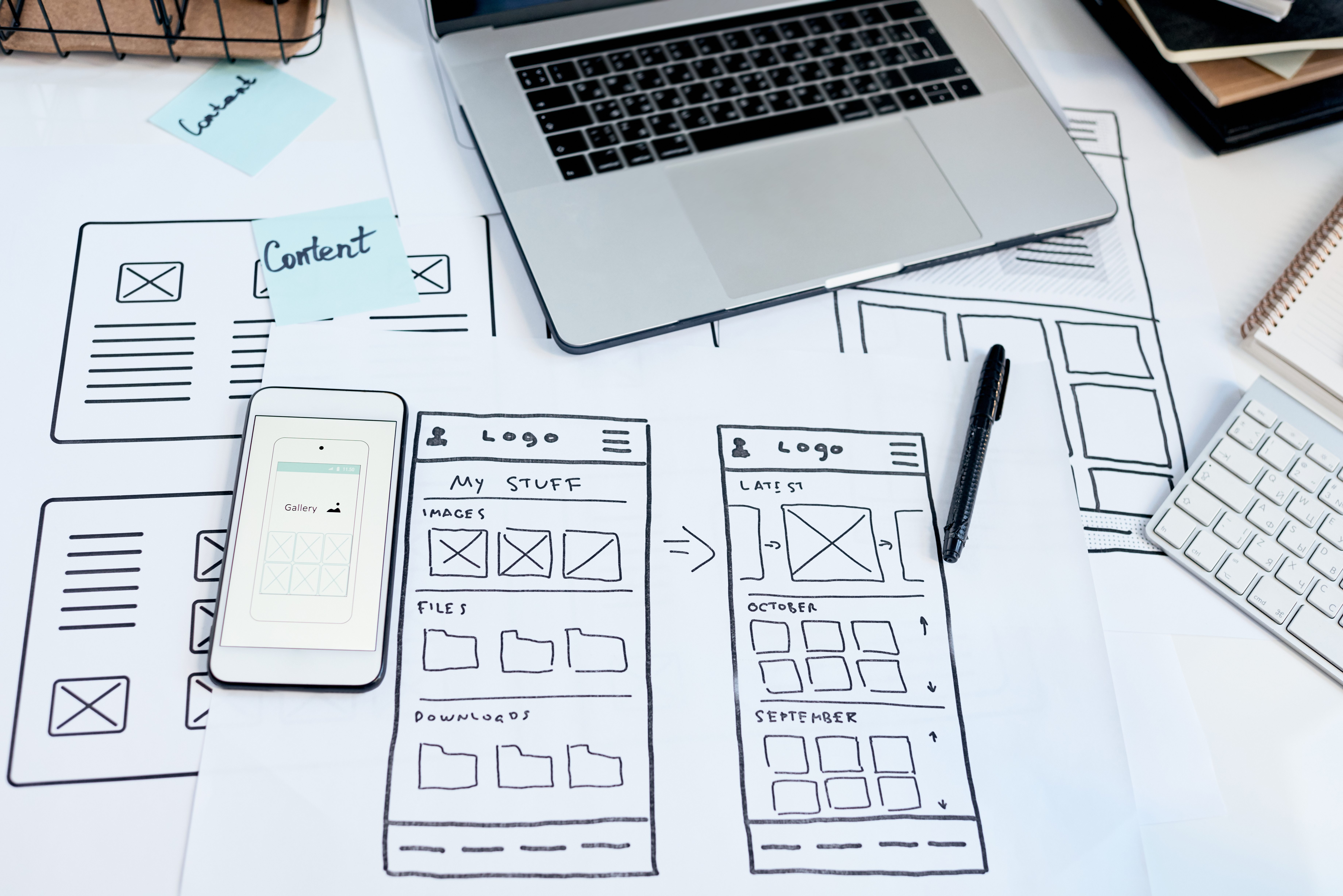
At Imperium Dynamics, we see Power Platform as more than a low-code development toolset. It is a way for organizations to modernize business processes, connect teams to better data, and deliver solutions at the pace their operations demand. But as more organizations scale their Power Platform investments, one truth becomes increasingly clear: faster app delivery only creates value when users can actually adopt and use the applications being built.
-
Product Area:
Microsoft Power Platform
-
Tags / Keywords:
UI/UX
Power Platform
Canvas Apps
Model-Driven Apps
Power Pages
Adoption
Design Systems
Accessibility
A technically sound app can still fall short if the experience feels confusing, inconsistent, or overloaded. That is why UI/UX is becoming a critical part of Power Platform maturity. The organizations that get the most from Power Platform are not just building apps quickly; they are building experiences that align to how people work.
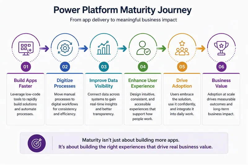
Figure 1: Power Platform Maturity: Technical Delivery and User Adoption
This is especially true because Canvas Apps, Power Pages, and Model-Driven Apps each provide different levels of design freedom. Canvas Apps offer more flexibility, Power Pages behave more like traditional websites, and Model-Driven Apps prioritize structured, process-driven experiences. Across all three, the goal is not to fight platform limitations, but to design effectively within them.
1. Context & Problem Statement
Purpose
Establish why UI/UX has become a core adoption challenge for organizations scaling Microsoft Power Platform. A technically sound app can still fall short when users find the experience confusing, inconsistent, or overloaded.
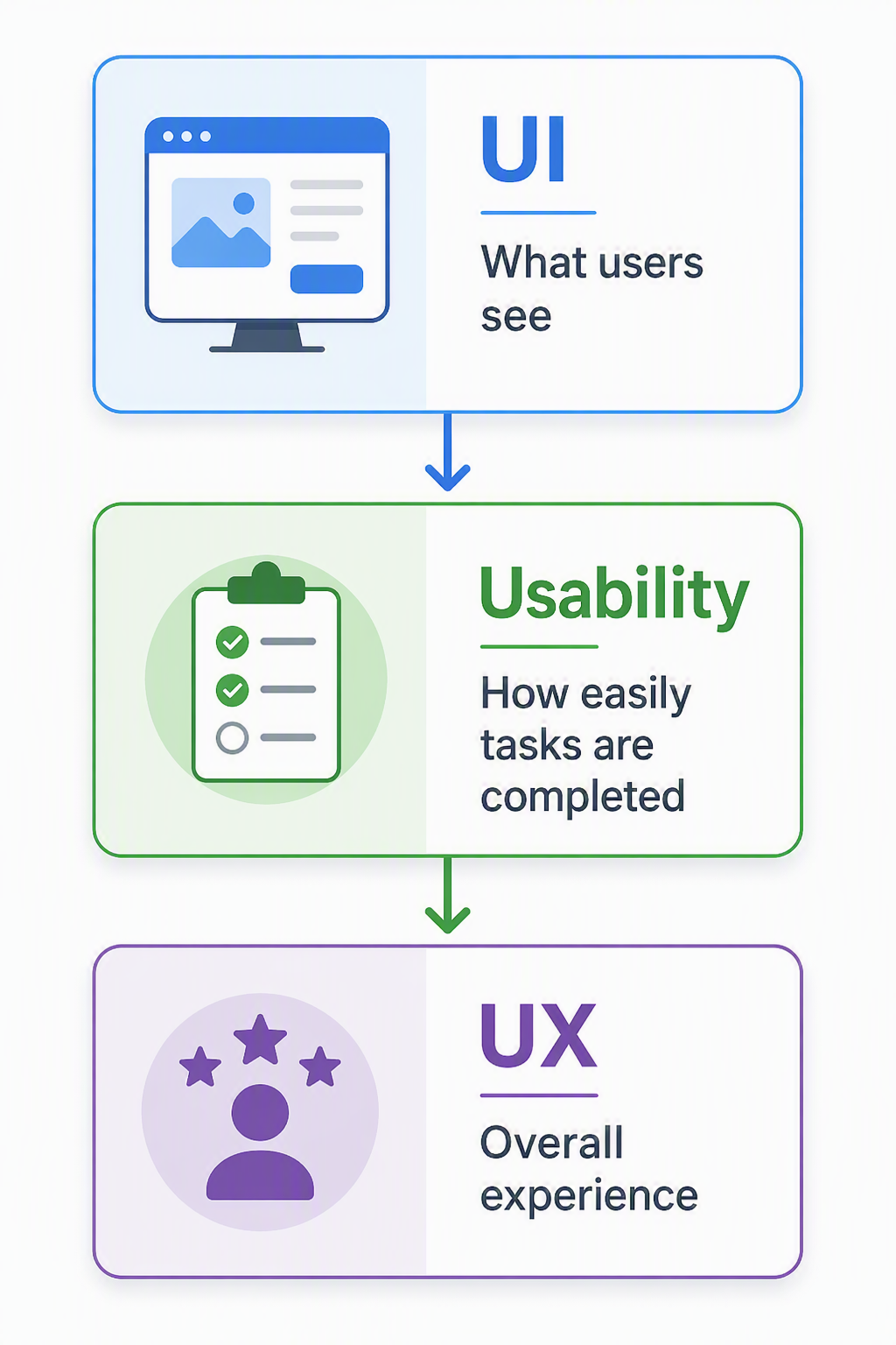
Figure 2: User Interface (UI) and User Experience (UX)
For organizations building modern business applications, that distinction matters because these solutions often support complex operational workflows: submitting requests, updating records, reviewing dashboards, approving work, managing service processes, or coordinating tasks through agents and automation. In those environments, design is not decoration. It is a productivity layer. Every unclear field, crowded form, or inconsistent button creates friction between the user and the business outcome the application was meant to support.
Core design principles still apply regardless of the platform: clarity, consistency, simplicity, accessibility, efficiency, and usability. Users should immediately understand what information they are viewing, what actions are available, and what steps they need to complete. The best Power Platform experiences reduce effort, not just visual clutter.
2. Architecture & Setup Overview
Purpose
Give readers a practical mental model for designing better Power Platform experiences before configuration begins. The overall approach is to understand the audience, map the workflow, identify friction points, define the right app type, and use UI/UX principles to guide how information, actions, and feedback appear across the solution.
Canvas Apps support flexible, custom layouts and reusable components when teams need tailored user experiences.
Power Pages work best when the solution behaves like a public or external-facing website or portal.
Model-Driven Apps prioritize structured, data-driven workflows where optimized forms, views, dashboards, and Business Process Flows guide the experience.
Prerequisites include a clear audience profile, process map, core data model, accessibility expectations, branding guidance, and a plan for testing with real users.
A Power Platform solution cannot succeed on requirements alone. It needs context: who will use it, what they are trying to accomplish, where the process becomes difficult, and how much guidance they need along the way. Business analysts play a key role here because they translate user needs and business workflows into the insight designers and developers need to build a solution that works in practice, not just on paper.
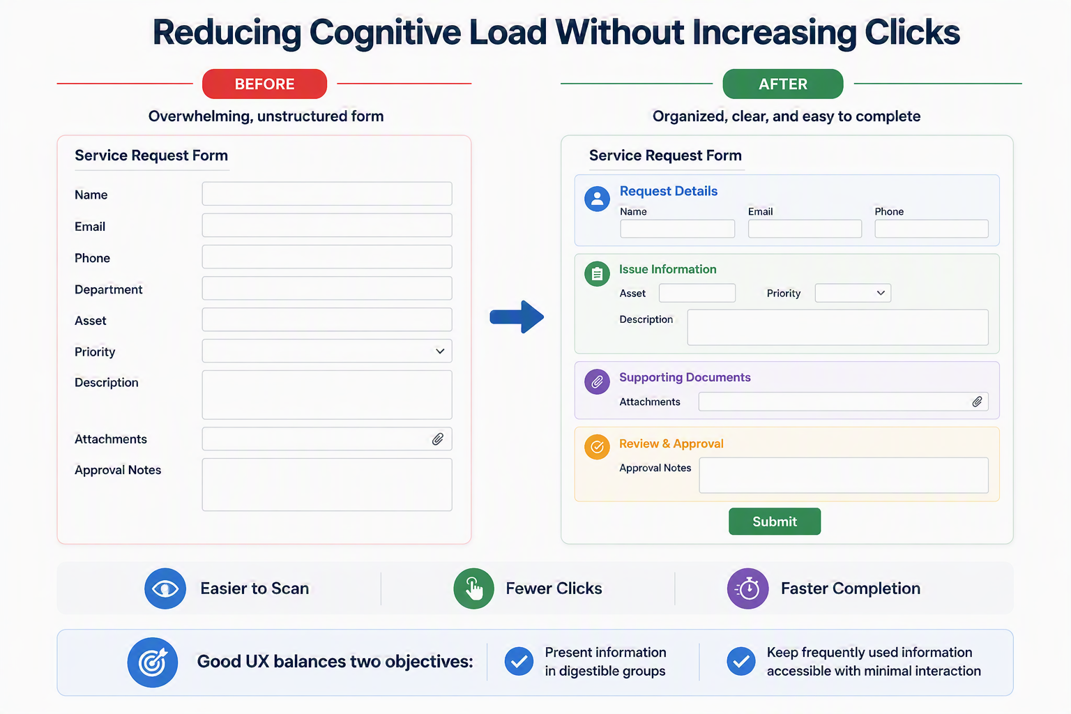
Figure 3: Foundations of Effective UI/UX Design
3. Applying UI/UX Principles in Power Platform
Purpose
Show how core UI/UX principles translate into real Power Platform experiences. The examples below pair practical design guidance with screenshots from Power Platform and Dynamics 365 solutions so readers can see how these principles appear in real applications.
Understand the user and workflow
Before designing an app, understand who will use it, the tasks they need to complete, the information they rely on, and where delays or confusion occur. Focus on designing around the user's workflow rather than the underlying data structure. A successful app supports how people actually work and provides the right level of guidance at each stage.
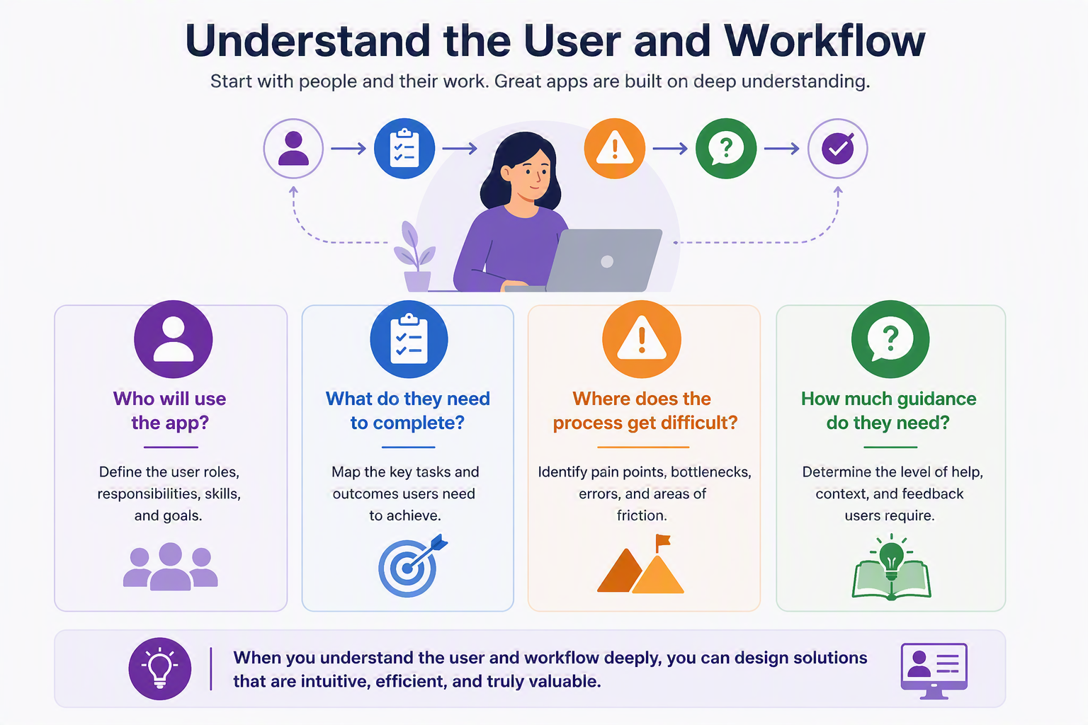
Figure 4: Understanding the User and Workflow
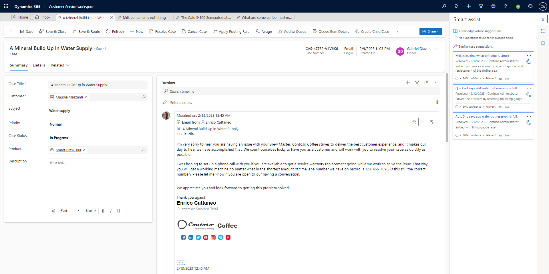
Figure 5: Dynamics 365 Customer Service Workspace demonstrates how an application can organize information and actions around the user's workflow.
What this demonstrates: The workspace brings together the information and actions an agent needs during daily case management, helping users stay focused on the task rather than navigating between separate screens.
Choose the right Power Platform experience
Select the experience that best supports the job to be done. Canvas Apps work well for highly tailored, task-focused experiences. Power Pages supports external users and self-service scenarios. Model-Driven Apps are ideal for structured business processes that rely on standardized data, forms, and workflows.
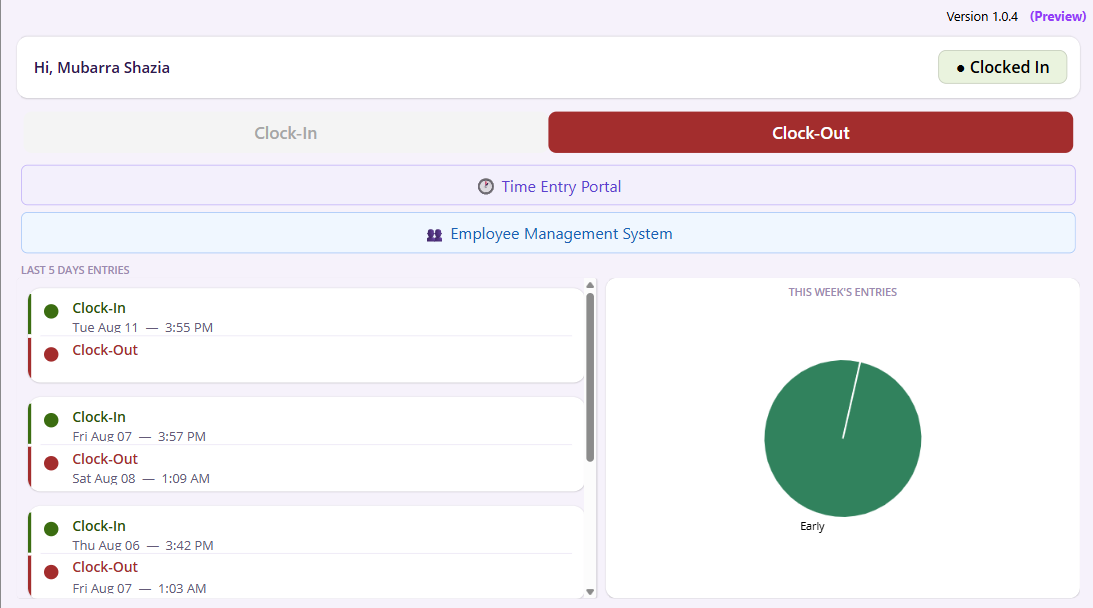
Figure 6: The Clocky Canvas App provides a simple task-focused experience for employee time tracking, demonstrating the flexibility of Canvas Apps for tailored business processes.
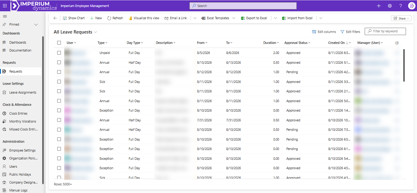
Figure 7: This Model-Driven App for Employee Management uses standardized views, navigation, and business processes to support consistent data management and record tracking across the organization.
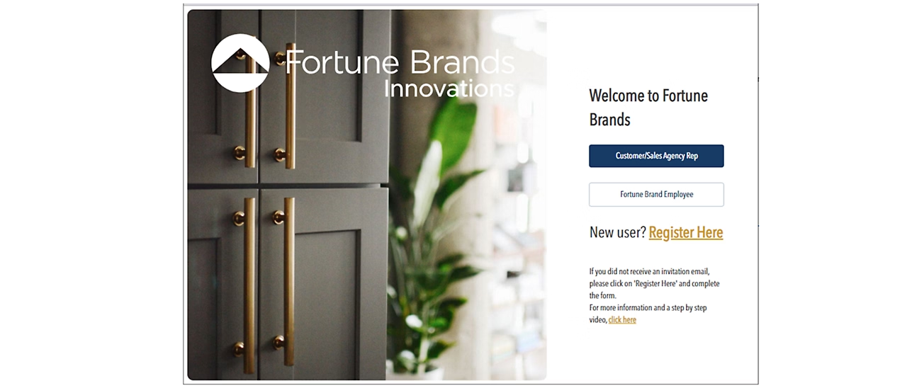
Figure 8: Fortune Brands Innovations uses Power Pages to provide a secure portal experience for clients, sales representatives, and employees, demonstrating how Power Pages supports external-facing and self-service scenarios.
What this demonstrates: The appropriate Power Platform experience depends on the users, process, and interaction model. Canvas Apps provide flexibility for focused tasks, Model-Driven Apps support structured internal processes, and Power Pages provides portal-style experiences for external users.
Plan the screen hierarchy
Put the most important information first, group related fields together, and make the next action obvious.
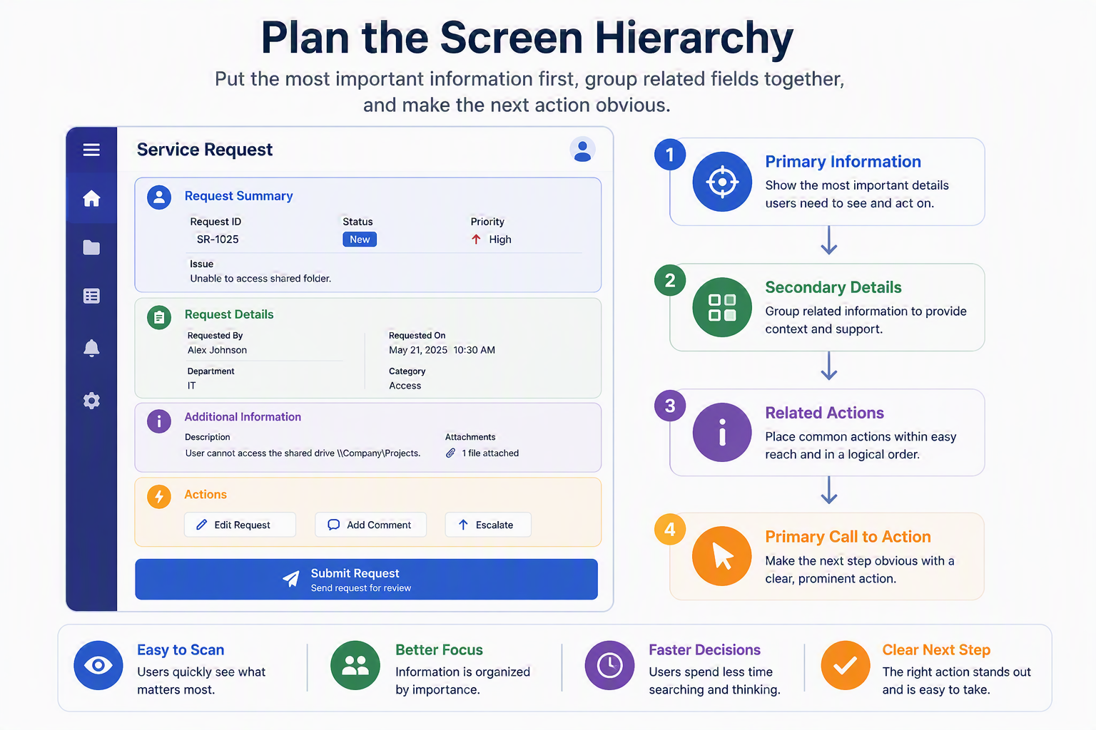
Figure 9: Planning Screen Hierarchy
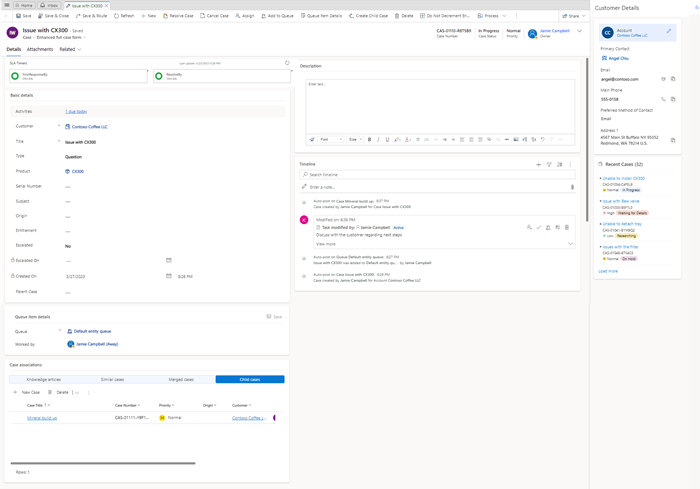
Figure 10: The Dynamics 365 Customer Service case form organizes primary case information, related details, client context, and actions into clearly defined sections to support efficient case management.
What this demonstrates: The Dynamics 365 Customer Service case form separates primary case information, client context, timeline information, and related records into distinct areas. This makes important information easier to locate while keeping supporting details available when needed.
Reduce cognitive load
Break dense forms into sections, tabs, or steps so users are not forced to process everything at once.
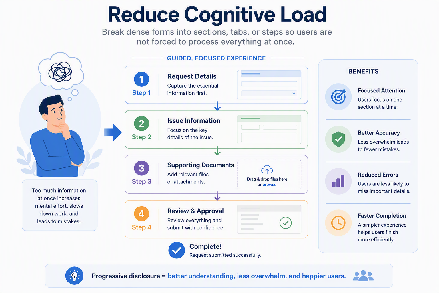
Figure 11: Reducing Cognitive Load
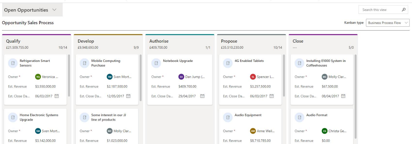
Figure 12: Dynamics 365 Sales uses Business Process Flows to guide users through opportunity stages, presenting relevant information progressively and reducing the cognitive load of complex sales processes.
What this demonstrates: The Dynamics 365 Sales Business Process Flow presents the sales process as a sequence of stages and focuses users on the activities relevant to the current stage, rather than requiring them to process the entire process at once.
Standardize patterns
Reuse consistent buttons, labels, spacing, icons, notifications, and navigation so users can move between apps with confidence.
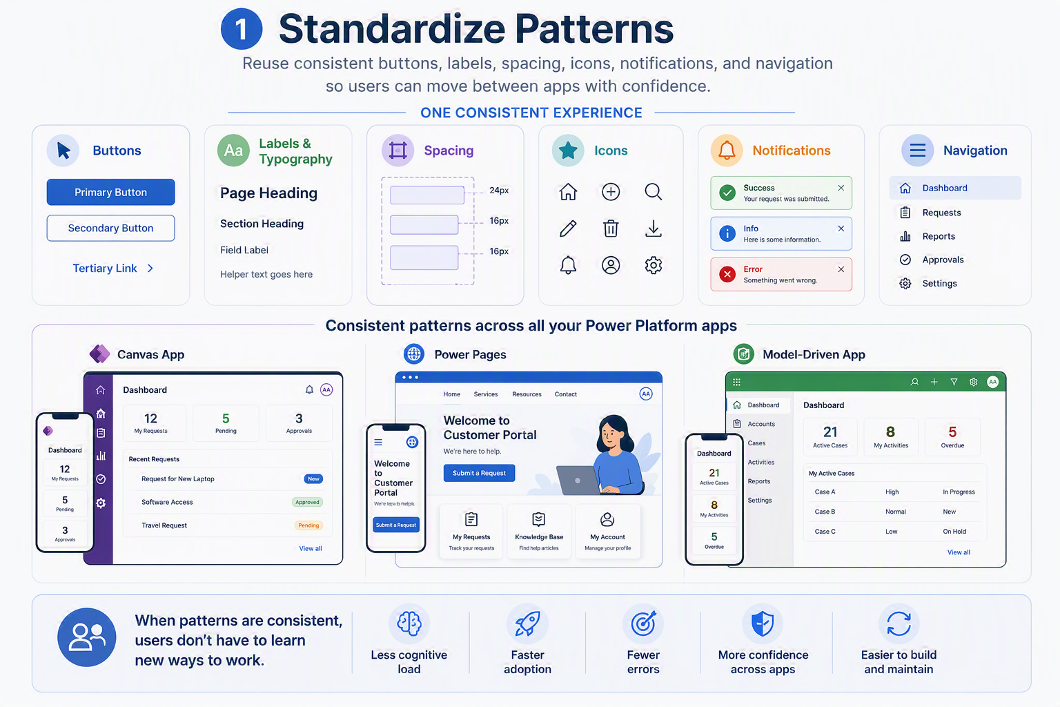
Figure 13: Standardizing Patterns
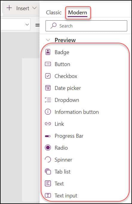
Figure 14: Power Apps Modern Controls provide standardized UI patterns and interaction elements, promoting consistency across applications and reducing the need for users to learn different interface conventions.
What this demonstrates: Power Apps Modern Controls provide familiar interaction patterns that can be reused across applications, helping users recognize common controls and reducing the need to learn different interface conventions.
Validate with real users
Review wireframes or early builds with the people who will use the solution and adjust based on where they hesitate, misread, or slow down.
For example, during functional validation of the Resource Utilization dashboard, the chart visualizations were reviewed using different data scenarios. The screenshots below show how the Y-axis scaling affected the readability of the charts: the first view uses a maximum Y-axis value of 2,000 despite the displayed values being significantly lower, while the second view uses a different scale for a similar visualization. This highlighted the need for chart axes to dynamically adapt to the highest relevant data value so users can interpret trends more easily.
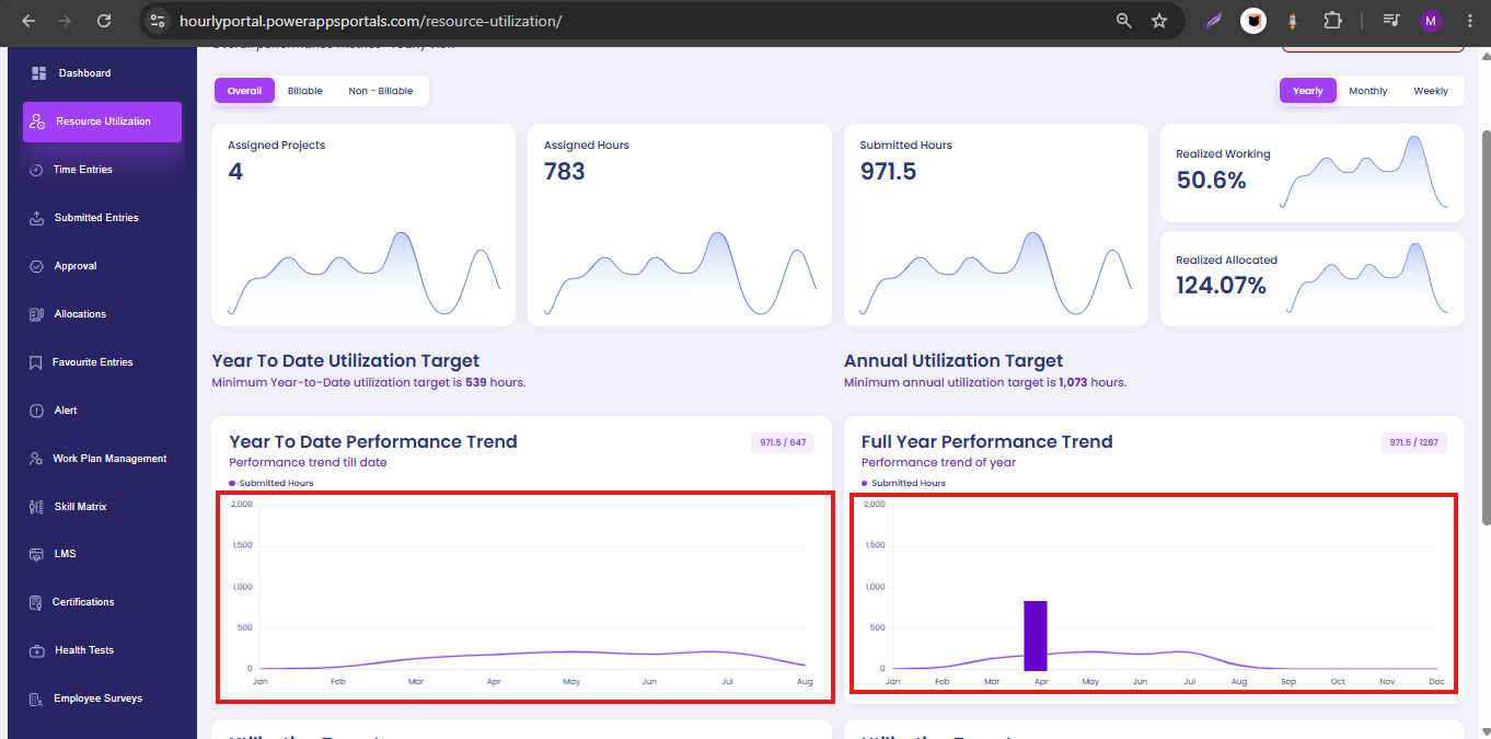
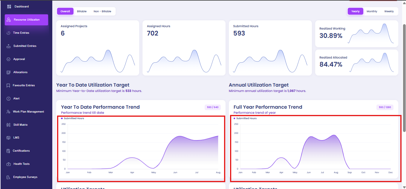
Figure 15: Resource Utilization dashboard validation identified inconsistent Y-axis scaling, demonstrating how testing with real data can reveal visualization and usability issues.
These examples show how UI/UX principles can be applied across different Power Platform experiences. The goal is not to make every application look the same, but to make each experience clear, consistent, accessible, and appropriate for its users, processes, and platforms.
4. Limitations & Best Practices
Purpose
Share practical lessons that help teams avoid common UI/UX mistakes in Power Platform delivery. The biggest limitation is that each Power Platform app type offers a different level of design flexibility, so teams should design within platform strengths instead of forcing every experience to behave the same way.
Table 1: Design Priorities and Best Practices for Power Platform Experiences
| Power Platform experience | Design focus | Best-practice guidance |
|---|---|---|
| Canvas Apps | Flexible, custom app experiences | Avoid over-customizing every screen. Use containers, auto layout, responsive structures, and reusable components to keep the app flexible and maintainable. |
| Power Pages | Website- or portal-style experiences | Prioritize navigation, readability, strong calls to action, mobile responsiveness, and performance because users experience the solution like a website or portal. |
| Model-Driven Apps | Structured, data-driven workflows | Focus on user experience improvements in workflow design through logical forms, tabs, views, dashboards, command bars, and Business Process Flows. |
| Accessibility | Inclusive and usable design | Treat readable typography, sufficient contrast, clear labels, logical navigation, and touch-friendly spacing as part of the design, not a final checklist. |
| Performance | Trust, speed, and usability | Remember that page speed, load time, and unnecessary customizations directly influence whether users perceive the app as trustworthy and worth using. |
For example, a service request form with sections for requester details, issue description, asset information, priority, attachments, and approval notes should not feel like one long checklist. Grouping those fields into logical sections such as “Request Details,” “Issue Information,” “Supporting Documents,” and “Review and Approval” helps users understand where they are in the process and reduces the effort required to complete the form accurately.
Additional techniques can make this even more effective, including multi-step forms, tabs, progressive disclosure, and conditional visibility. These patterns allow teams to show information only when it is relevant, which keeps the interface cleaner and helps users stay focused on the task in front of them.
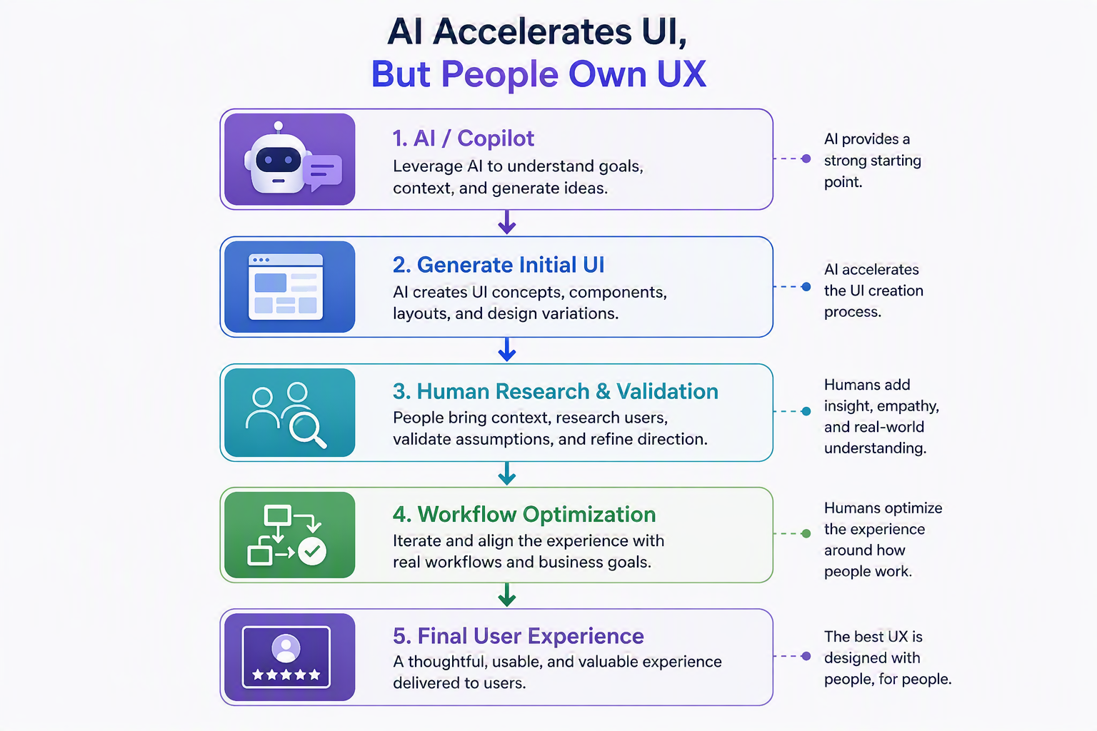
Figure 16: Human-Centered AI-Assisted User Experience (UX) Design Process in Microsoft Power Platform
Consistency Creates Trust
Consistency is one of the simplest and most powerful improvements teams can make. Buttons should use consistent colors, sizing, and placement. Forms should follow consistent spacing, labels, and typography. Icons should share the same style and avoid unnecessary visual details.
For organizations scaling Power Platform, consistency becomes even more important. Users may move between multiple apps, dashboards, and workflows. When those experiences follow familiar patterns, users feel more confident and need less time to learn. That confidence is a major driver of adoption.
For organizations building multiple Power Platform solutions, a lightweight design system can help maintain that consistency at scale. This can include standards for typography, color palettes, button styles, form layouts, cards, tables, icons, spacing, notifications, and modal patterns. A design system gives teams a shared foundation, so every app feels connected, even when it is built for a different process or audience.
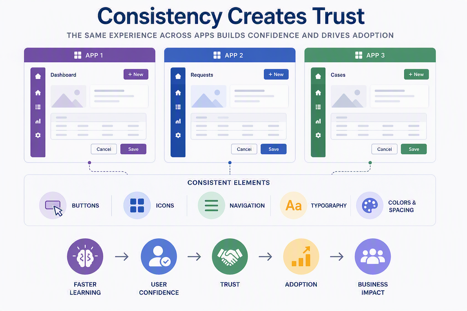
Figure 17: Cross-Application UI Consistency Through Standardized Design Elements
White Space Is a Productivity Tool
White space is often misunderstood as empty space, but it is more accurately a form of breathing room. It gives content space to be read, helps users focus, and prevents screens from feeling visually crowded.
For Power Platform applications, this matters because users usually open an app to complete a task, not to admire the interface. White space helps remove visual noise, so the task feels simpler, even when the underlying process is complex.
Navigation Is the Difference Between Momentum and Friction
Unclear navigation is one of the most noticeable mistakes that can hurt engagement. If users do not know where they are, where to go next, or what action matters most, the app begins to feel harder than the process it was meant to improve.
Clear navigation builds momentum. It helps users move through a process without stopping to decode the interface. For newer users, lightweight guidance such as tooltips or an introductory product tour can reduce uncertainty and make the first experience more approachable.
Feedback also plays a major role in navigation and usability. Every meaningful user action should create a clear response, whether that is a success message, error message, loading indicator, progress state, or confirmation dialog. Users should never be left wondering whether an action worked or what they need to do next.
Platform-Specific Design Choices Matter
While the same UI/UX fundamentals apply across Power Platform, each app type benefits from a different design emphasis. In Canvas Apps, containers, auto layout, reusable components, responsive structures, and clear information hierarchy help teams create flexible but maintainable experiences. Reusable components are especially valuable because they allow teams to standardize headers, navigation, buttons, cards, filters, and notification patterns across multiple screens or apps without redesigning the same elements each time. In Power Pages, navigation structure, readability, strong calls to action, mobile responsiveness, and performance become especially important because users interact with the experience more like a website or portal.
Table 2: App Type Selection Criteria and Example Business Scenarios
| App type | Best option when… | Example scenario |
|---|---|---|
| Canvas App | The experience needs a highly tailored layout, guided task flow, or simplified interface for a specific role. | A field technician needs a mobile-friendly inspection app with large buttons, photo uploads, conditional questions, and step-by-step guidance. |
| Model-Driven App | The process depends on structured data, relationships, stages, views, dashboards, and repeatable workflows. | A service operations team needs to manage cases, assets, approvals, status updates, and reporting from a centralized system. |
| Power Pages | The experience needs to serve external users through a secure website or portal. | Clients, vendors, or partners need to submit requests, check status, update information, or access resources without using an internal app. |
Model-Driven Apps require a different mindset. Because they are designed around structured data and repeatable business processes, the strongest design improvements usually come from workflow clarity rather than visual flexibility. Well-organized forms, logical tabs and sections, effective views, simplified command bars, strategic dashboards, and Business Process Flows can make structured applications easier to use and more valuable for day-to-day work. This same principle applies to broader business application experiences, including solutions that use agents or automation: the experience should make the process easier to understand, guide users through the right steps, and reduce friction across handoffs.
Performance and Accessibility Are Part of the Experience
A strong Power Platform experience also depends on performance and accessibility. Page speed, load time, and unnecessary customizations directly affect how users perceive the quality of an application. Performance is not just a technical concern; it is a UX factor. The same is true for accessibility. Sufficient color contrast, readable typography, clear labels, logical navigation, and touch-friendly spacing help ensure more users can complete their work successfully across devices and interaction preferences.
5. Real-World Example
Purpose
Validate the design approach with a practical business scenario. Consider a service request application built on Power Platform for an operations team. The original process uses a long form with requester details, issue description, asset information, priority, attachments, approval notes, and status updates all competing for attention on one screen.
A stronger experience groups the same work into clear sections such as Request Details, Issue Information, Supporting Documents, and Review and Approval. Conditional visibility shows only the fields that matter for the selected request type, while progress states and confirmation messages help users understand what happened and what comes next. The result is not a less complex process; it is a clearer process that users can complete with less hesitation and fewer errors.
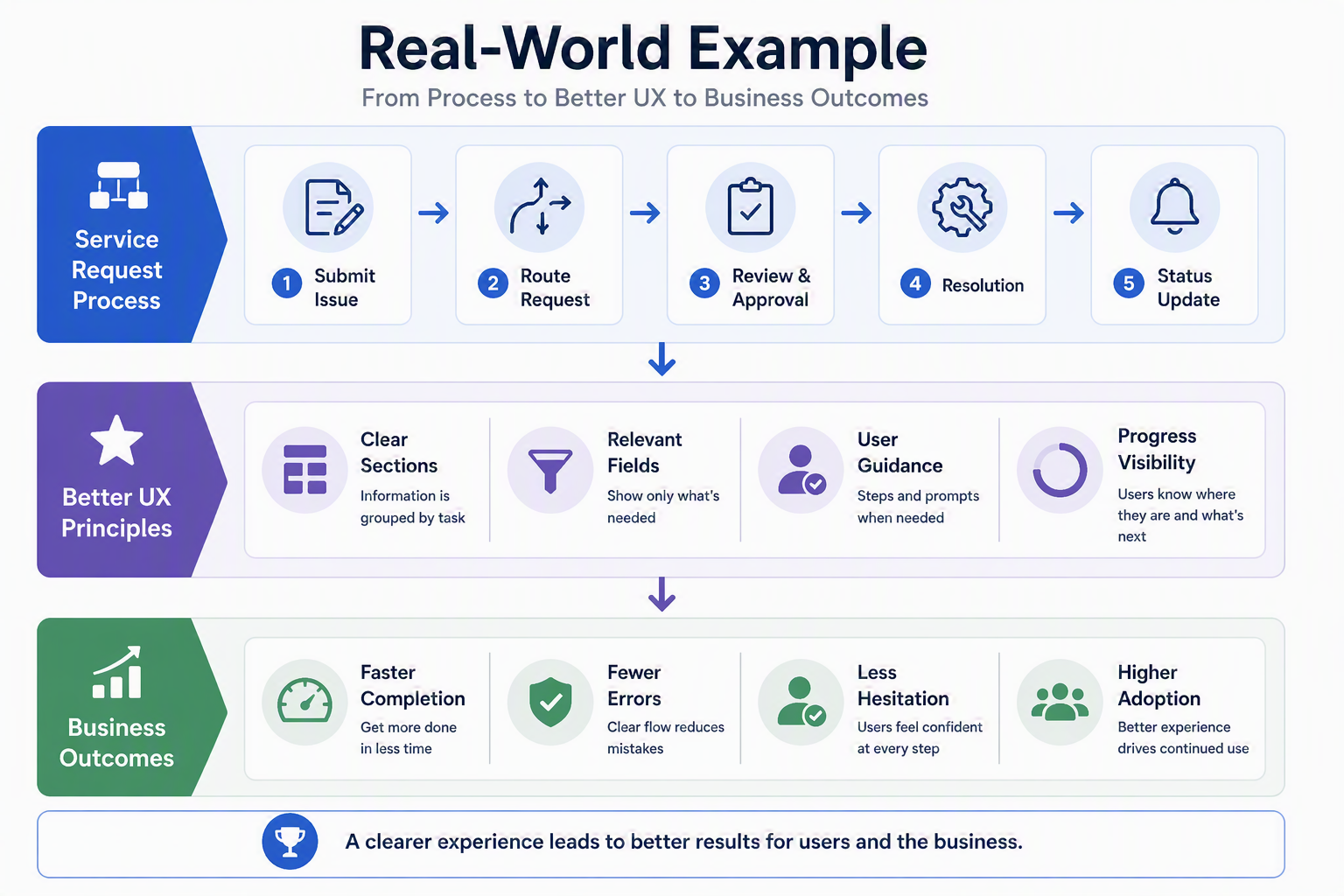
Figure 18: Real-World Service Request Scenario Demonstrating UX Improvements and Business Outcomes
AI Can Accelerate UI, but It Cannot Own UX
AI and Copilot are becoming valuable tools in the early stages of Power Platform design. They can help generate starting points for components such as forms, buttons, fields, and layouts. They can also support research, summarize patterns, and make it easier to begin from a blank page.
But this is where the distinction between UI and UX becomes critical. AI can produce interface ideas, but it does not fully understand the user’s process, business context, or points of friction inside a workflow. It can accelerate the first draft, but people still need to shape the experience, validate it, and iterate. At Imperium Dynamics, we see AI as an accelerator for thoughtful design, not a replacement for it.
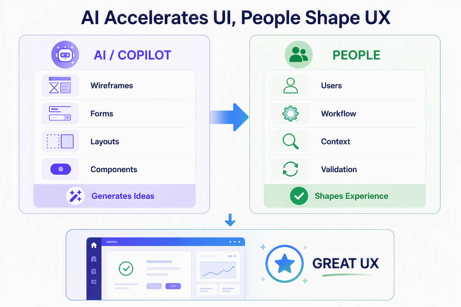
Figure 19: AI-Accelerated UI and Human-Led UX
A Practical Framework for Better Power Platform Experiences
A practical starting point for better Power Platform experiences includes three steps: understand the target audience, research comparable and competitor applications, and create a wireframe before moving into detailed design. Competitor research is especially useful because it reveals patterns users may already expect, highlights where other tools create friction, and helps teams identify opportunities to deliver a cleaner, more intuitive experience. Qualitative research should then be used to validate whether the direction makes sense.
This framework reflects a mature approach to Power Platform delivery. The strongest applications are not just technically functional. They are designed around the people, tasks, and decisions that define the business process. That is where low-code solutions become long-term business assets.
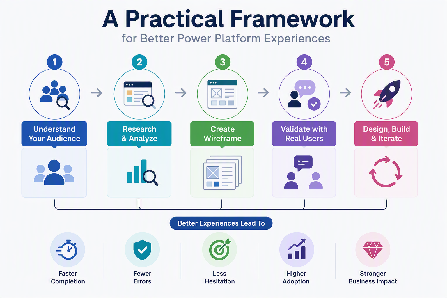
Figure 20: Practical Approach to User-Centered Power Platform Design
6. Key Takeaways & Resources
Key Takeaways
Treat UI/UX as an adoption driver: A fast-built app still fails if users cannot understand or trust it.
Design from user context: Requirements are not enough; teams need to understand who is using the app and how they work.
Use competitor research intentionally: Comparable applications can reveal familiar patterns, common frustrations, and opportunities to create a better user experience.
Work within platform strengths: Canvas Apps benefit from reusable components and flexible layouts, while Model-Driven Apps benefit from optimized forms, views, dashboards, and Business Process Flows.
Use hierarchy to reduce decision fatigue: The interface should make important information obvious.
Reduce cognitive load: Break dense forms and crowded screens into clearer, more manageable experiences.
Build consistency into the system: Repeated patterns and lightweight design systems help users learn faster and feel more confident.
Prioritize accessibility and performance: Readability, contrast, mobile responsiveness, and speed are all part of the user experience.
Use AI strategically: Let AI accelerate early UI concepts, but keep UX ownership with people who understand the workflow.
The Bottom Line
Power Platform gives organizations the ability to build faster, but long-term value depends on whether those solutions are adopted, trusted, and embedded into daily work. Better UI/UX does not always require advanced customization. Often, it comes from disciplined fundamentals: clarity, hierarchy, consistency, simplicity, accessibility, efficiency, performance, and a deep understanding of the user.
At Imperium Dynamics, we help organizations design and deliver Power Platform solutions that do more than function technically. We focus on experiences that support real workflows, reduce friction, work within platform constraints, and create lasting adoption. The best business applications are built with intention, consistency, and a clear understanding of the people who rely on them every day.

Carter Gilliland |


Mubarra Shazia |
Posted on: September 2026