|DILAWAR ALI SHARIQ
CSS Grid Layout has revolutionized the way we design web
layouts, providing a powerful, flexible system that
makes it easy to create complex, responsive designs with
minimal code. In this blog, we'll dive deep into the
world of CSS Grid, exploring its core concepts,
practical applications, and advanced techniques to help
you master this essential tool.
Introduction to CSS Grid
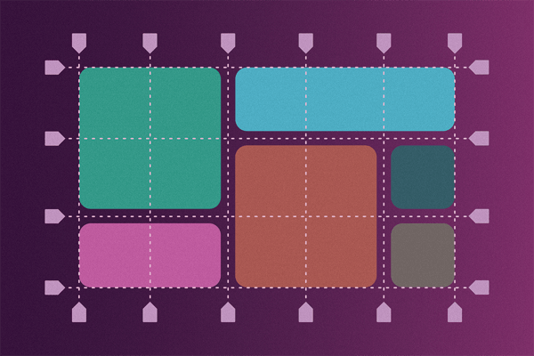
CSS Grid Layout is a two-dimensional layout system that allows you to create grid-based designs directly in CSS. Unlike Flexbox, which is one-dimensional (either a row or a column), CSS Grid can handle both rows and columns simultaneously, making it ideal for complex layouts.
Basic Concepts
Before we dive into examples, let's cover some key concepts:
- Grid Container: The element on which display grid is applied. It becomes the parent of all grid items.
- Grid Item: The direct children of the grid container.
- Grid Lines: The lines dividing the grid into cells. They can be either vertical (column lines) or horizontal (row lines).
- Grid Tracks: The space between two grid lines, essentially rows or columns.
- Grid Cell: The smallest unit of the grid, defined by the intersection of a row and a column.
- Grid Area: A rectangular area composed of one or more grid cells.
Creating a Grid Container
To start using CSS Grid, you need to define a grid
container. This is done by applying display: grid to a
parent element:
.container {
display: grid;
}
You can define the rows and columns of your grid using
the grid-template-rows and grid-template-columns
properties. Each property accepts a space-separated list
of values representing the size of each row or column.
.container {
display: grid;
grid-template-columns: 100px 200px 100px;
grid-template-rows: 50px 100px;
}
In this example, we have a grid with three columns and
two rows.
Placing Items in the Grid
Implicit and Explicit Grid
When you define your grid, you're creating an explicit grid. However, if you place items outside of these bounds, CSS Grid will automatically create new rows and columns, forming the implicit grid.
Grid Item Placement
You can place items in specific grid cells using the
grid-column and grid-row properties.
.item1 {
grid-column: 1 / 3;
grid-row: 1 / 2;
}
This code places .item1 spanning from the first column
line to the third column line (covering two columns) and
from the first row line to the second row line (covering
one row).
Named Grid Lines
For better readability, you can name grid lines and
place items relative to those names.
.container {
display: grid;
grid-template-columns: [start] 100px [middle] 200px
[end];
grid-template-rows: [top] 50px [bottom];
}
.item1 {
grid-column: start / middle;
grid-row: top / bottom;
}
Advanced Techniques
Grid Template Areas
One of the most powerful features of CSS Grid is the
ability to define grid areas.
.container {
display: grid;
grid-template-areas:
"header header"
"sidebar main"
"footer footer";
grid-template-columns: 1fr 3fr;
grid-template-rows: auto;
}
.header { grid-area: header; }
.sidebar { grid-area: sidebar; }
.main { grid-area: main; }
.footer { grid-area: footer; }
In this example, we define named areas and assign them
to the respective items, making the layout more
intuitive and easier to manage.
Responsive Grids
Creating responsive designs with CSS Grid is
straightforward using the fr unit, which represents a
fraction of the available space, and media queries.
.container {
display: grid;
grid-template-columns: repeat(auto-fit, minmax(200px,
1fr));
}
This setup ensures that the columns adjust based on the
container's width, maintaining a minimum column size of
200px.
Aligning and Justifying Items
CSS Grid provides properties to control the alignment and justification of grid items:
- align-items and justify-items for the entire grid.
- align-self and justify-self for individual items.
.container {
display: grid;
align-items: center;
justify-items: center;
}
.item1 {
align-self: start;
justify-self: end;
}
Conclusion
Mastering CSS Grid Layout opens a world of possibilities for creating responsive, complex web designs with ease. By understanding the basic concepts and exploring advanced techniques, you can leverage CSS Grid to its full potential, making your layouts more intuitive and maintainable.
Remember to experiment with different configurations and combine CSS Grid with other layout tools like Flexbox to create versatile and robust designs. Happy coding!