|Abdul Wasay
Did you know that companies that use data to make decisions see a 5-6% boost in productivity? This shows how important tools like Microsoft Power BI are for getting insights from data. This tutorial will help you learn how to make a Power BI dashboard, from the basics to advanced designs.
Power BI is a key player in business intelligence. It combines data visualization and analysis to help make strategic decisions. Creating a Power BI dashboard is more than just putting data together. It's about turning it into a story that moves your business forward. Our tutorial is for everyone, whether you're experienced or new to Power BI dashboards.
This tutorial will teach you the key steps of designing a Power BI dashboard. You'll learn how to pick the right metrics and customize visuals. This way, your dashboards will not just tell a story but also motivate your audience to act. Making a Power BI dashboard can be easy with our help, and we're here to make it simple.

Key Takeaways
- Understanding the importance of data-driven decision-making for enhancing productivity.
- Familiarizing with Microsoft Power BI as a tool for powerful data analysis and visualization.
- Essential steps and best practices to create effective Power BI dashboards.
- Key considerations in Power BI dashboard design to convey a compelling data story.
- Lasting benefits of adopting a Power BI dashboard for business intelligence needs.
Understanding Power BI and Its Dashboard Capabilities
Today, businesses rely more on data to make decisions. The tools they use to understand and analyze this data are key. Power BI is a top choice for data visualization and business intelligence. It helps companies make quick, informed decisions. We'll look at why Power BI is vital for businesses, focusing on its dashboards and how to develop them.
What is Power BI?
Power BI is a powerful analytics service from Microsoft. It offers great data visualization through an easy-to-use interface. Users can link to many data sources and turn raw data into clear, visual stories. This tool is great for both tech experts and those who aren't, making it useful in any business setting.

The Importance of Dashboards in Data Analysis
Dashboards are key in data analysis. They give a quick look at performance and important data. Good dashboards help businesses keep track of their health and make quick, data-based decisions. With Power BI, dashboards can be customized to show the right metrics, helping improve efficiency across departments.
Key Features of Power BI Dashboards
Power BI dashboards stand out with several important features:
- Real-Time Updates: Dashboards show data in real-time, letting users act fast on changes and opportunities.
- Custom Visuals: Users can make their own visuals or pick from many in the platform, making dashboards fit specific business needs.
- Data Connectivity: Power BI connects to many data sources, making it easier to bring together different data types for better dashboards.
- Sharing and Collaboration: Dashboards and reports can be shared easily with team members, promoting teamwork in data-driven decisions.
As companies learn how to make dashboards in Power BI, these features make it a must-have for integrating complex data into decisions. Using these features can change how organizations work and compete.
Setting Up Your First Power BI Environment
Starting your journey with power bi report creation means setting up a strong Power BI environment. This setup is key for those wanting to build dashboard power bi well and fast. We'll walk you through the important steps to start your first dashboard. This will give you a good base for your data analysis work.

To start, sign up for Power BI Service on the official Microsoft website. You'll see options based on your business size and needs. After signing up, download and install Power BI Desktop. This is where you'll design most of your dashboard.
The Power BI interface might look complex at first, but it's made to be easy to use. It lets you work with data sources smoothly, which is key for build dashboard power bi. Here's a quick guide to the main parts you'll get to know:
- Home: Access to basic features like save, export, and get data.
- Insert: Where you can add new visualizations or modify existing ones.
- Model: Essential for managing relationships between your data tables.
- View: Adjusts how you see your workspace and controls the grid and page settings.
Setting up your first dashboard is more than just installing software. Here are three key steps to set up your Power BI environment:
- Configure your dataset: Make sure your data is clean and structured right.
- Understand the types of visualizations that best represent your data.
- Start with simple reports before moving to complex analytical dashboards.
The secret to great power bi report creation is not just in making dashboards. It's also in understanding and working with your data to get insightful results.
Steps to Import Data into Power BI
Learning how to import data into Power BI is key for making a successful dashboard. This step is vital. It means picking the right sources and getting the data ready for visualization.
Choosing the Right Data Sources
Choosing the best data sources is the first step in Power BI dashboard creation. You need data that's accurate, relevant, and updated regularly. Companies use internal systems like CRM and ERP, and external databases for their data.
Data Import Methods in Power BI
Power BI has many ways to bring in data, depending on what you need and the type of data. You can query data for real-time insights or import it for deeper analysis. Using Power BI Desktop, you can connect to various data sources like files, databases, and online services with the 'Get Data' feature.
Cleaning and Preparing Data for Analysis
Cleaning and preparing data means getting rid of duplicates, fixing errors, and changing data formats. This step is crucial before making a dashboard. It makes sure the dashboard shows correct and useful insights, helping with better decision-making.
By carefully following these steps for importing data, you set the stage for a successful Power BI dashboard. This leads to better strategic decisions.
Designing an Effective Power BI Report
Creating a great power bi report means knowing how to design it well and make it work. A good Power BI report shares data in a way that makes it easy to understand and helps with making decisions. Here, we'll look at how to make a create dashboard in power bi that works well and looks good.
When it comes to power bi dashboard design, think about the layout and visuals you use. The layout should lead the viewer through the data smoothly. Use visuals in a smart way to make the flow logical. It's also key to pick the right charts and visuals for each purpose they serve.
- Bar or Column Charts: Great for comparing groups or tracking changes over time.
- Line Graphs: Perfect for showing trends at regular intervals.
- Pie Charts: Good for showing parts of a whole.
To make a good create dashboard in power bi, think about making it interactive. Use things like slicers, dropdown menus, or tooltips to turn reports into tools that users can interact with. This lets users focus on the data they care about most.
In the end, making a successful Power BI report is all about smart design. It's about making sure the data is not just seen but really helps people understand things.
Create Dashboard in Power BI
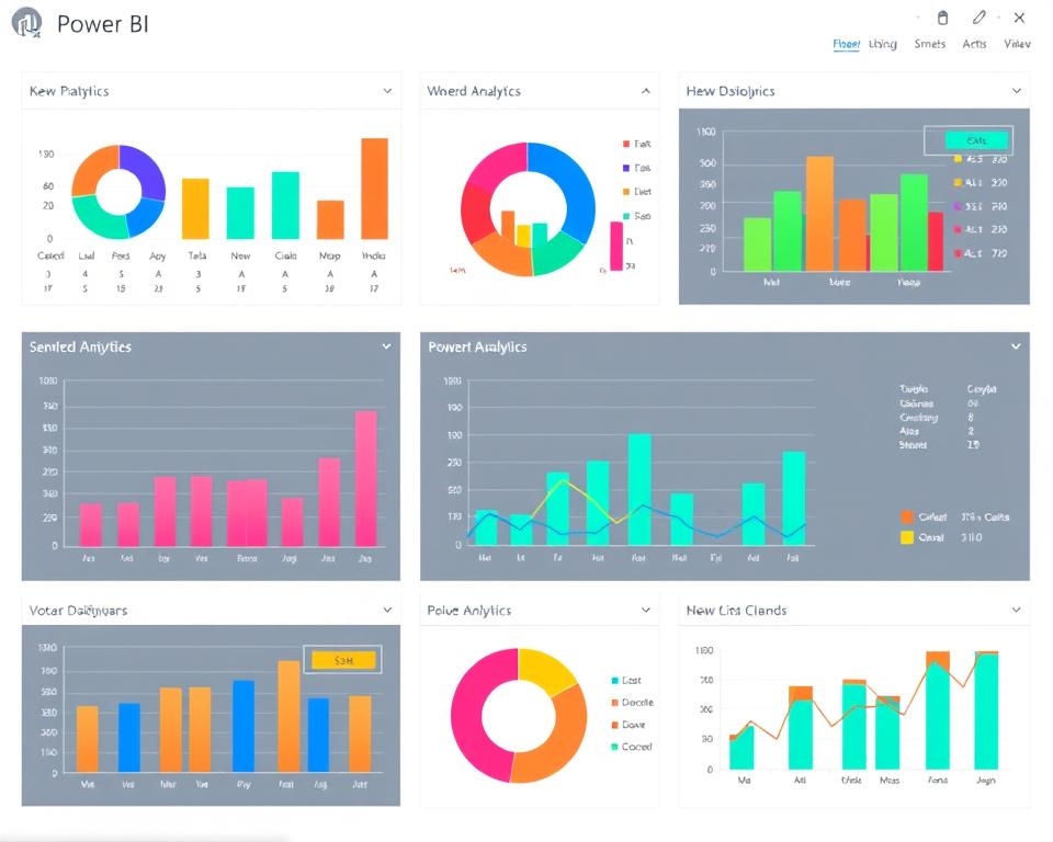
The journey through data analysis leads us to a critical juncture – the power bi dashboard creation. Here, the art of data visualization comes to life, turning raw data into a clear story. A well-designed dashboard shows the stories in the data and helps decision-makers see trends, outliers, and patterns easily. To make such a powerful tool in Power BI, you need to pick visuals, customize the design, and add interactive parts for a smooth user experience.
Selecting Visuals for Your Dashboard
Starting to make a Power BI dashboard, pick visuals that match the data's message. Power BI has many charts, graphs, and gauges to help share your findings. Choose based on what best shows your metrics and helps users understand quickly. For example, a bar graph for distribution growth or a pie chart for market share, each visual should have its own role in telling the dashboard's story.
Customizing Layout and Design
The look of your dashboard is key to keeping users interested. Customizing the layout means putting visuals in a logical order, making sure each part is easy to find and fits the overall story of Power BI data visualization. Use design principles like balance, contrast, and alignment to make a dashboard that looks good and works well. This makes it more engaging and encourages users to explore more.
Linking Interactivity Between Dashboard Components
Interactivity makes any modern dashboard come alive, letting users dive deeper into the data for specific insights. Power BI is great at linking interactivity between parts of the dashboard. This means changing one visual can affect the whole dashboard. By connecting these interactive parts, your Power BI dashboard turns into a dynamic platform for deep data exploration.
FAQ
What exactly is a Power BI dashboard?
A Power BI dashboard is a single-page view in Microsoft Power BI. It gives a quick look at key metrics and data. It helps users understand their data better and make informed decisions.
Why are dashboards essential in data analysis?
Dashboards are key in data analysis. They make complex data easy to understand. This helps in finding insights, tracking KPIs, and making quick business decisions.
What are the significant features of Power BI dashboards?
Power BI dashboards have real-time updates and interactive parts. They can be customized and accessed on different devices. They also offer advanced visualization and secure sharing of insights.
How do I start with Power BI for the first time?
To begin with Power BI, sign up for the service and install the Power BI Desktop if needed. Then, get familiar with the interface. After that, start making your reports and dashboards.
How do I choose the right data sources for my Power BI dashboard?
Choose data sources that are trustworthy and fit your analysis goals. They should be in a format Power BI can handle. Common sources include Excel, SQL databases, web services, and cloud platforms.
What methods can I use to import data into Power BI?
You can import data into Power BI in several ways. Options include connecting to live databases, importing files, using the Power BI service, or Power Query for complex data handling.
How should I clean and prepare my data for analysis in Power BI?
Clean your data by removing duplicates and fixing errors. Make sure all values are consistent. Then, prepare it for analysis by transforming it as needed.
What are the principles of effective Power BI report design?
Good Power BI report design focuses on clarity and simplicity. Use a layout that guides the viewer. Choose visuals that clearly show your data and highlight important info.
How do I select the right visuals for my Power BI dashboard?
Choose visuals that show the pattern in your data well. Use charts for trends, maps for location data, and tables for details. Think about your audience and the dashboard's purpose when picking visuals.
What are some customization options for layout and design in Power BI?
What are some customization options for layout and design in Power BI?
How can I link interactivity between components of my Power BI dashboard?
To link parts of your dashboard, use Power BI's slicers for filtering. Enable detailed exploration with drill-through. Set bookmarks to save report states

